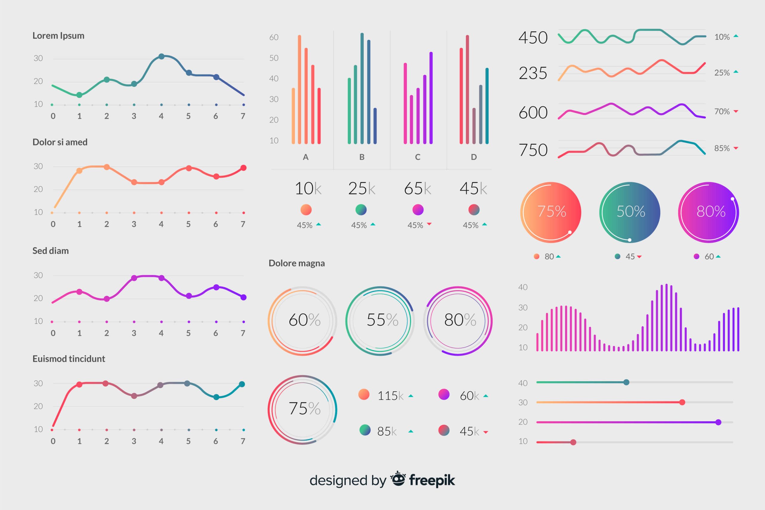
Charts are a great way to communicate information visually. They can help you see patterns and trends in data that you may not be able to see just by looking at numbers. Charts can also help you to quickly see how your business is doing compared to previous periods or to your competitors.
There are many different types of charts, including scatter charts. Scatter charts are used to compare two or more sets of data. By plotting the data points on a scatter chart, you can see how they are related and identify any patterns that may exist. This can help you to better understand the data and make informed decisions based on that information. Continue reading for three common uses for scatter charts.
1. Identifying Patterns

Many businesses collect and store data that can be used to identify patterns, which in turn can help businesses improve their products and services. For example, a business might collect data on how customers use its website and their spending habits. By identifying these patterns, the business can improve the website’s design and make it more user-friendly and adjust its marketing strategies and products to better meet the needs of its customers.
Scatter charts are a great way to compare data points and identify patterns. They can be used to compare two or more data sets to see if there is a correlation between them, identify which data points are most influential in causing a pattern, and compare data over time to see if there is a trend.
2. Identifying Clusters and Outliers
If you want to find clusters and outliers in your data, you can use a scatter chart. If you see a lot of points clustered together, that means there is a strong correlation between those two variables. If you see a lot of points spread out, that means there is no correlation between those two variables.
Outliers are points that are far away from the rest of the data and can be indicative of errors or unusual activity that should be investigated. They can also be used to identify opportunities or risks for the business. For example, if there is an outlier in sales data, this may be an indication that a new product is doing well and the business should consider increasing its production. Alternatively, if there is an outlier in customer data, this may be an indication that the business is losing customers and it should investigate why. By identifying outliers, you can determine if they are affecting the results and take them into account when making decisions.
3. Predicting Future Outcomes

Scatter charts are highly useful in predicting future outcomes. By analyzing the data and looking for patterns, you can make predictions about how the data will behave in the future.
There are a few main reasons businesses need to predict future outcomes using data. First, making informed strategic decisions is critical for businesses. They need to know what products and services to offer, what prices to charge, where to expand, and so on. Data can help them make these decisions by providing insights into what customers want and need, what competitors are doing, and what trends are emerging.
Understanding customer behavior and needs is also important. Businesses can use data to see what products and services are being searched for, what websites people are visiting, and what interests them. This information can help businesses create more effective marketing campaigns, design better products, and understand what customers are looking for.
Finally, predicting future outcomes using data can help businesses improve operations. Data can help identify areas where improvements need to be made, such as in customer service, product development, or logistics. By understanding what is happening in these areas, businesses can make changes that will improve their bottom line.
Scatter plots are just one of many useful chart types, but knowing how to use them is crucial to your company’s success. Take advantage of scatter charts to assist you in making informed decisions about future investments or strategies.


