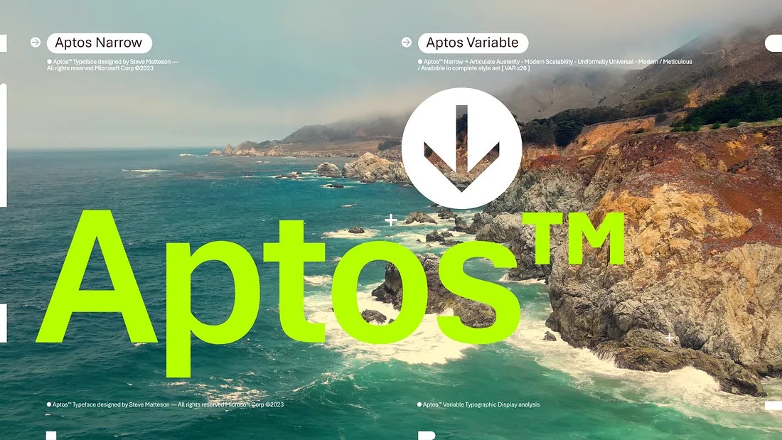
As of this week, Calibri is no longer Microsoft’s default font. Aptos, a sans serif typeface inspired by mid-20th-century Swiss typography, has taken its place. Aptos will start appearing as the new default font across Word, Outlook, PowerPoint, and Excel today.
Microsoft announced back in April 2021 that it was looking to move on from Calibri as its default font. The company commissioned five custom fonts that would compete for a chance to replace Calibri: Bierstadt, Grandview, Seaford, Skeena, and Tenorite. On Friday, Microsoft announced that Bierstadt had won, albeit with a new name.
“The typeface was created by Steve Matteson, one of the world’s leading type designers,” wrote Si Daniels, an Office principal program manager. “Steve renamed the typeface he designed from Bierstadt to Aptos after his favorite unincorporated town in Santa Cruz, California, whose widely ranging landscape and climate epitomizes the font’s versatility.”
Here’s how Daniels describes the new typeface in a Microsoft Design blog post:
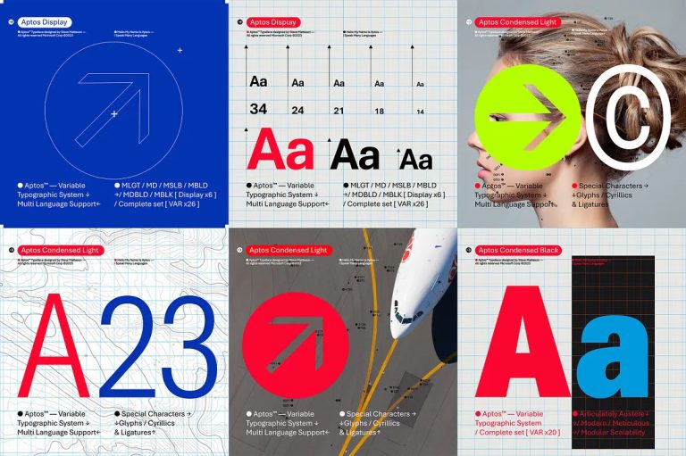
Aptos, made of varying geometric shapes, is bold, well-defined, directive, and constrained. It articulates many different languages and tones. Stem ends are clean cut. Subtle circular squares within the letters’ contours allow higher legibility, especially at small sizes.
As noted above, this is the first time Microsoft has changed the default font across its products in over a decade. In Office 2007, Calibri replaced Times New Roman as the default font in Word and Arial as the default font in PowerPoint, Excel, Outlook, and WordPad. Now Microsoft will make the transition to Aptos across all of its Microsoft 365 apps.
If you aren’t ready to dive right into Aptos, Microsoft says Calibri will still be pinned at the top of the new font menu, which is currently only available on the web. You can also still find Grandview, Seaford, Skeena, and Tenorite in the font menu, and if you prefer another font altogether, you can always change your default font in the settings menu.
Personally, I think 15 years is plenty of time for one font to dominate an entire ecosystem of products. Change is hard, but Aptos is an attractive, modern font that should add some life to your next resume or PowerPoint presentation. Plus, knowing how lazy most of us are, we’re not going to bother with picking a different font once the default changes.
“Aptos is a part of a broader wave of features coming to Microsoft 365,” Daniels adds. “We’re pushing to make the software more expressive and inclusive. There’s a newly designed font picker experience, along with new themes, colors, and backgrounds. These updates signify our devotion to those who use M365 the same way a mechanic does a toolbox, or an artist does a paint brush.”
Stay connected with us on social media platform for instant update click here to join our Twitter, & Facebook
We are now on Telegram. Click here to join our channel (@TechiUpdate) and stay updated with the latest Technology headlines.
For all the latest Technology News Click Here
For the latest news and updates, follow us on Google News.